Design and User Experience Connect with Your Customers
Our visual designers tell your brand story in a way that connects with your customers and builds loyalty. Whether a new logo, an infographic or a full website, we take pains to understand your business deeply and express your message with sophisticated, compelling design. Our user experience (UX) experts take your website, application or online experience to the next level. Rigorous UX design makes the difference between a clunky and a graceful application. Your customers (and your staff) will love you for it.
We Offer
- Brand and logo design
- Marketing collateral design
- Website design
- User Experience design
- Custom illustration
- Infographics
- Interactive design
- Print design
- Focus groups
Tools We Use
Design Research
Conceptual Analysis
Wireframes
Moodboards
Interactive Prototypes
Personas and Scenarios
Audience Analysis
Front End Frameworks
Selected Projects

Bioquell: Designing to Sell an Invisible Product
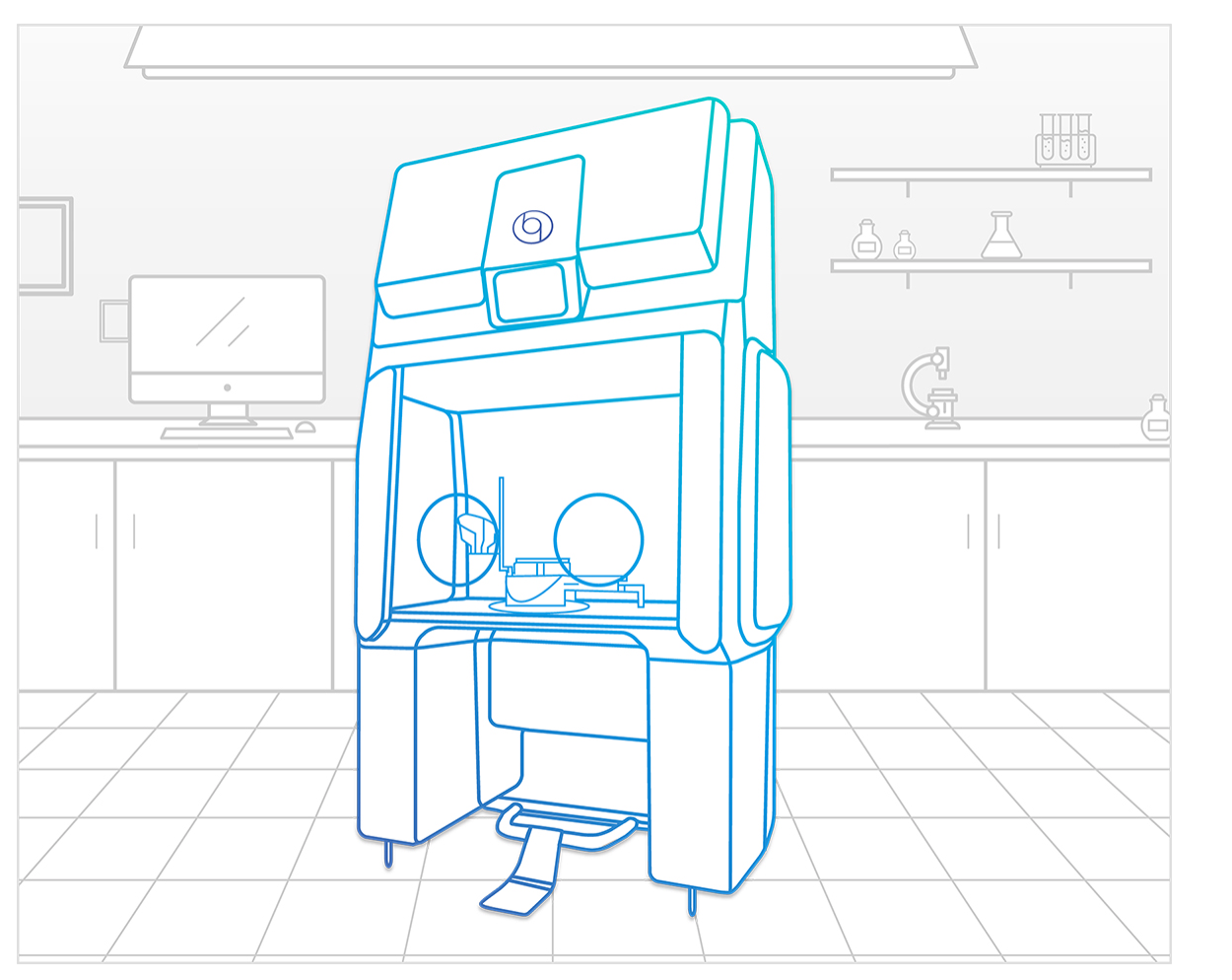
How do you sell an invisible product whose benefits are also invisible? Bioquell, a maker of hydrogen peroxide vapor decontamination systems (an invisible vapor that kills microorganisms) engaged Tecture to redesign its website and other collateral materials. Tecture re-architected the site – emphasizing the solutions the HPV technology provides in various industries. We also gave the site it’s signature look by creating stylized illustrations of all of Bioquell’s products. These illustrations are also core to the company’s marketing collateral. Tecture concepted and developed infographics for visualizing the business case for using Bioquell decontamination technology as well.
Selected Features
Qube Illustration
A key feature of the website's design is line-drawing illustrations of Bioquell's products, for example the Qube.
Illustrating the invisible 1
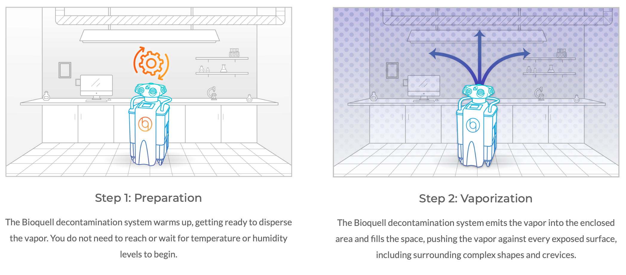
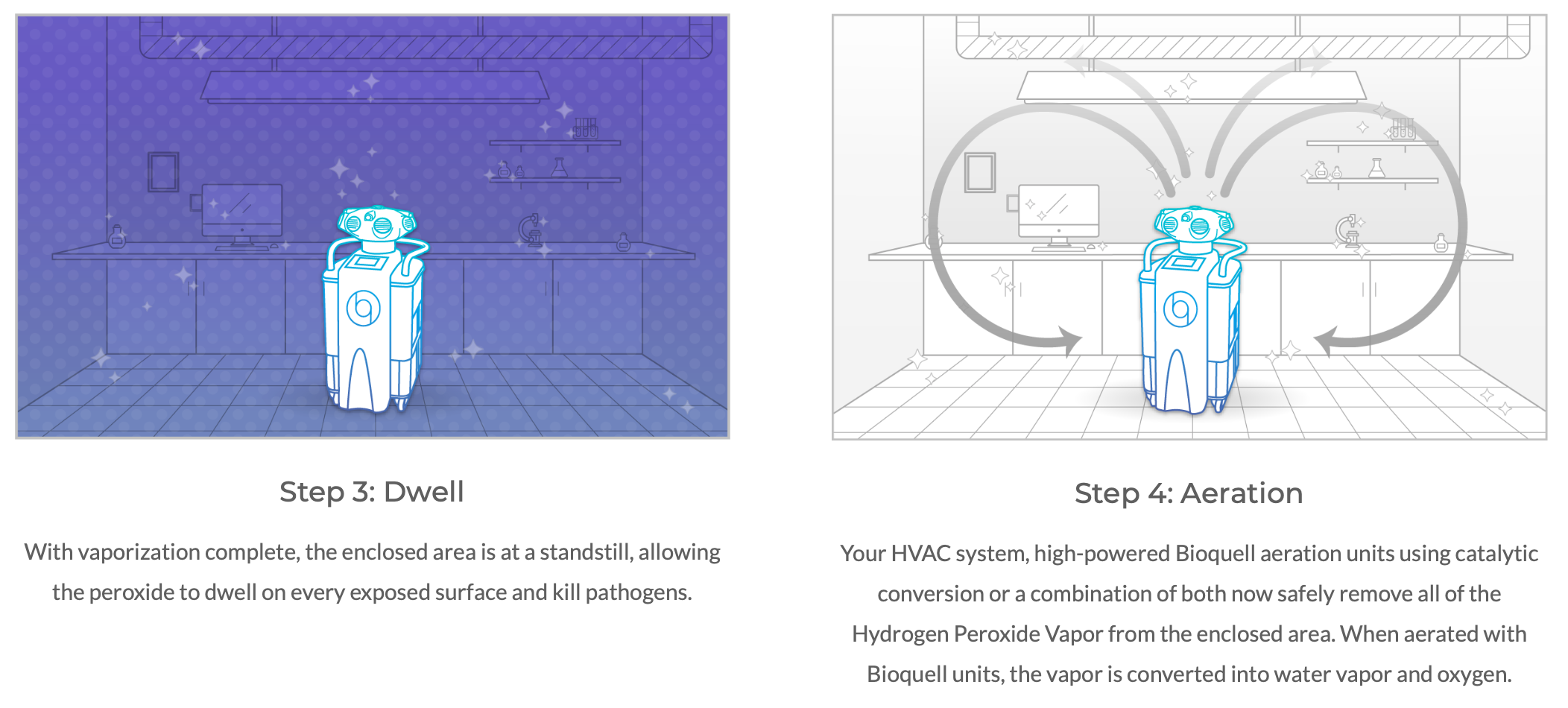
Tecture created custom illustrations to visualize how invisible hydrogen peroxide vapor sterilizes.
Illustrating the Invisible 2
Tecture created custom illustrations to visualize how invisible hydrogen peroxide vapor sterilizes.

McGonigel’s: Savvy Technology Supports a Texas Down-Home Vibe
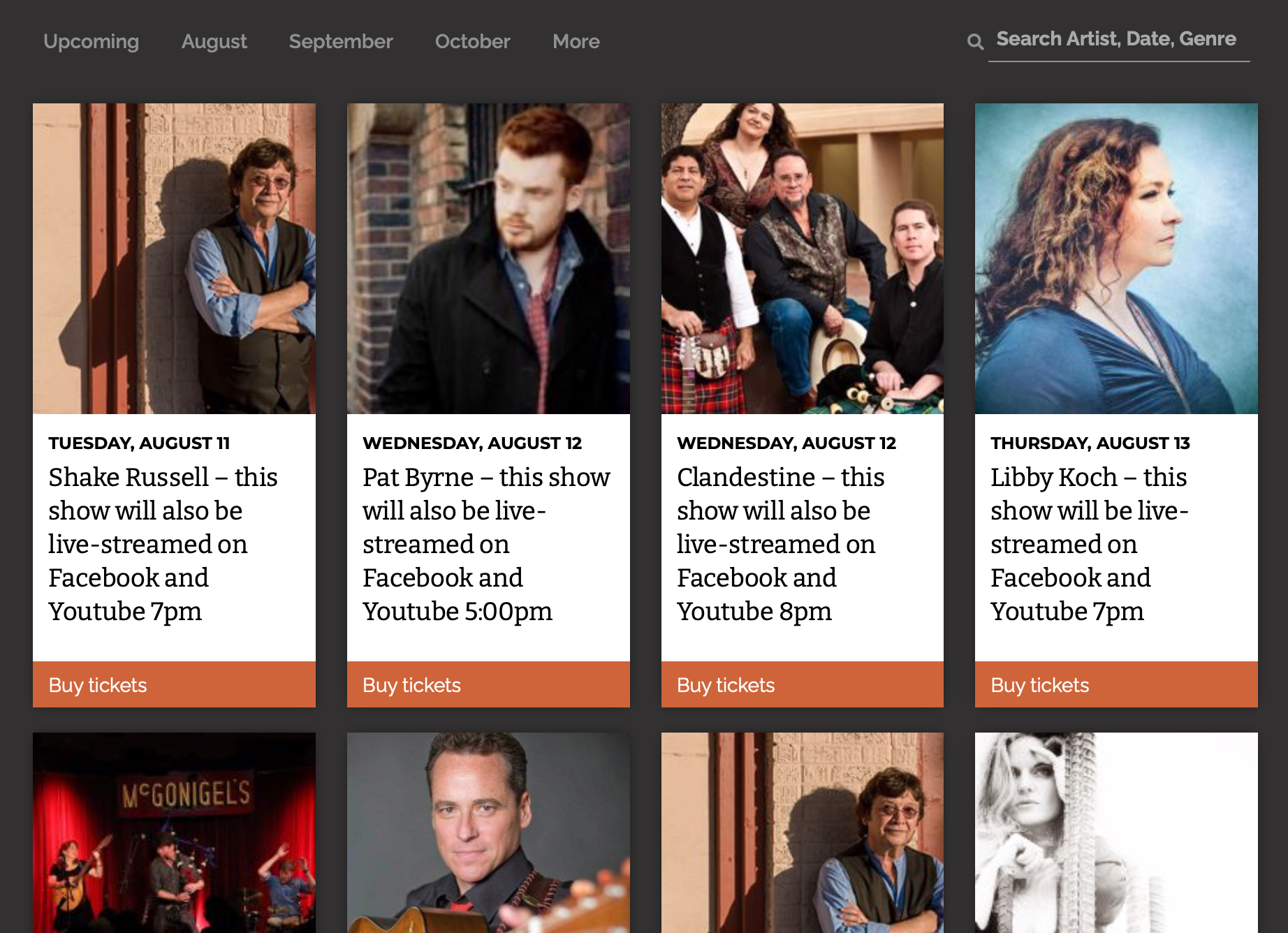
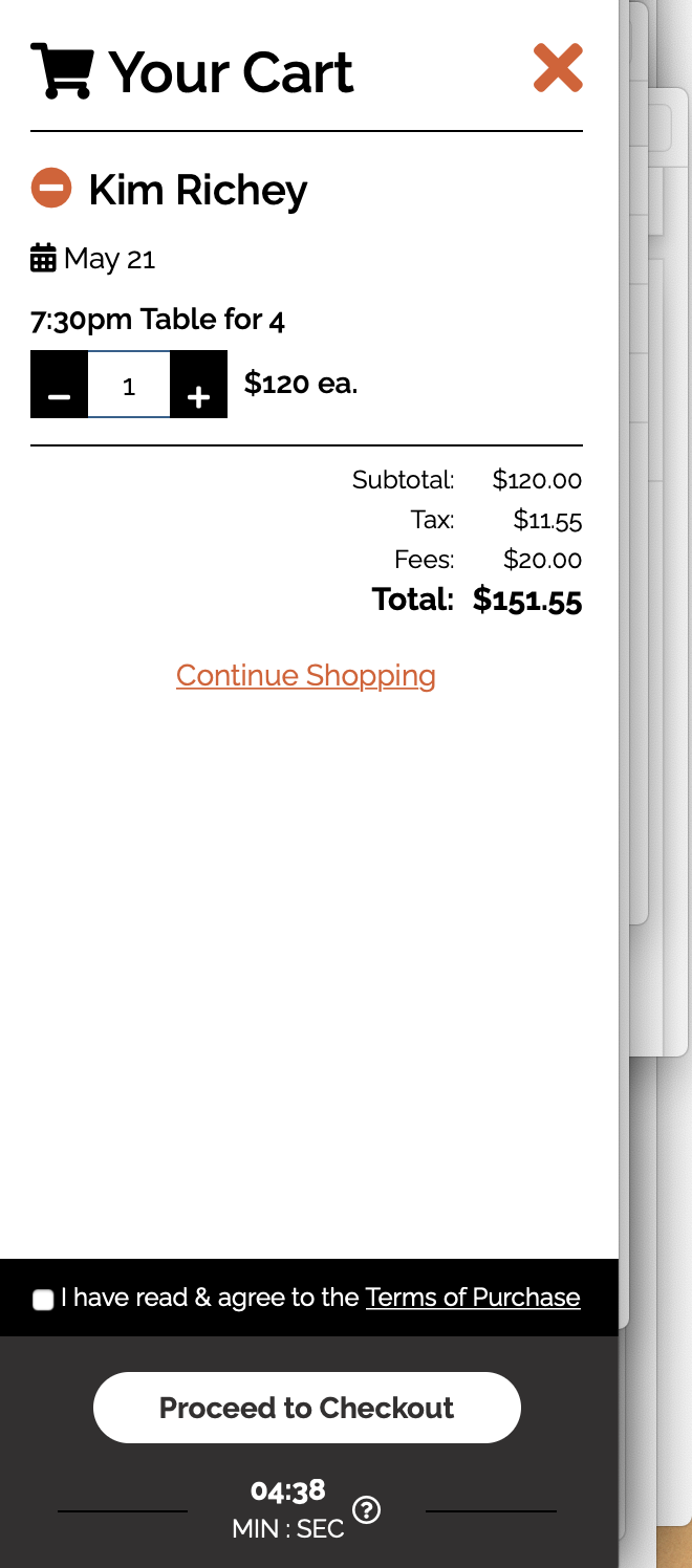
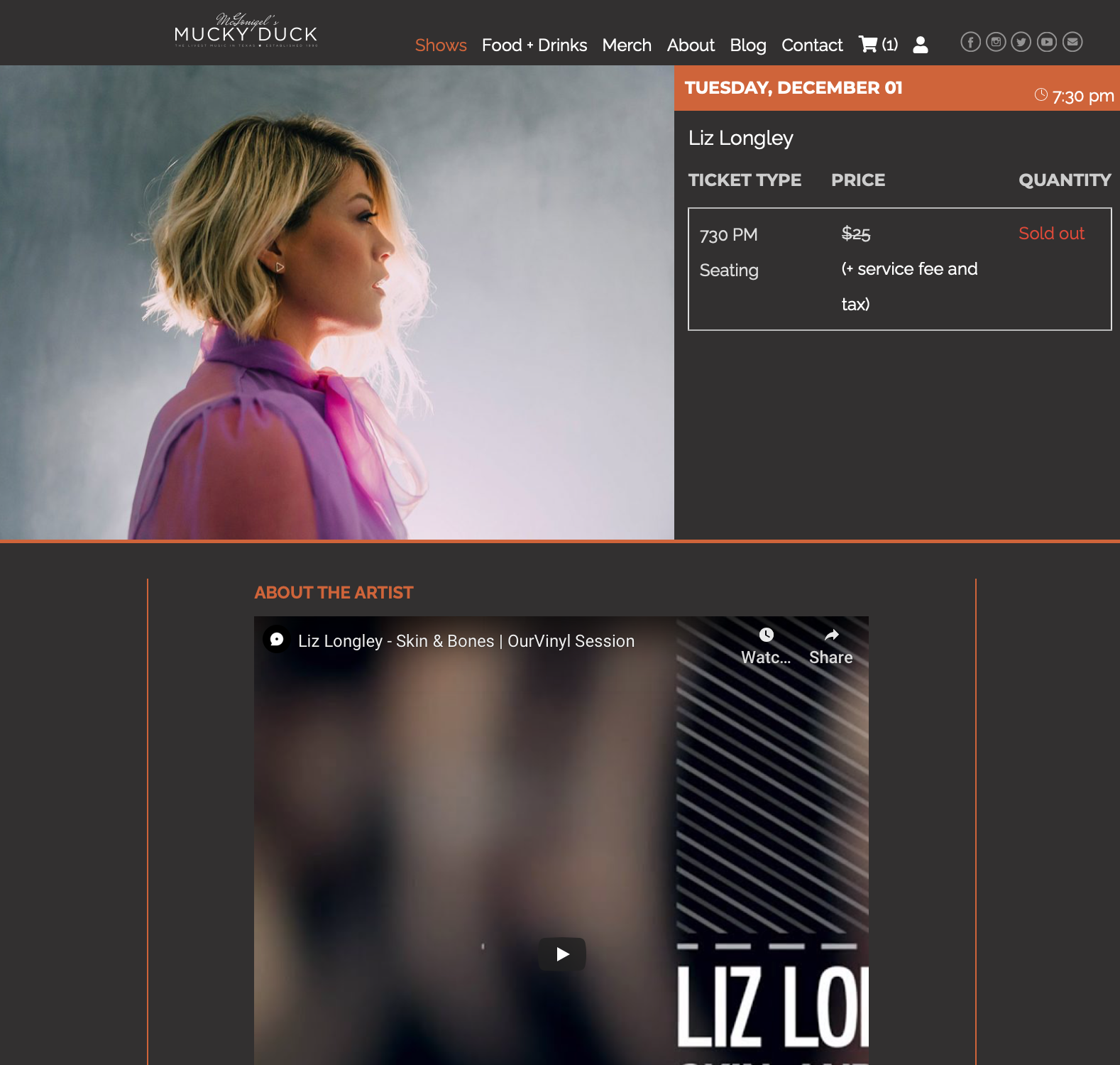
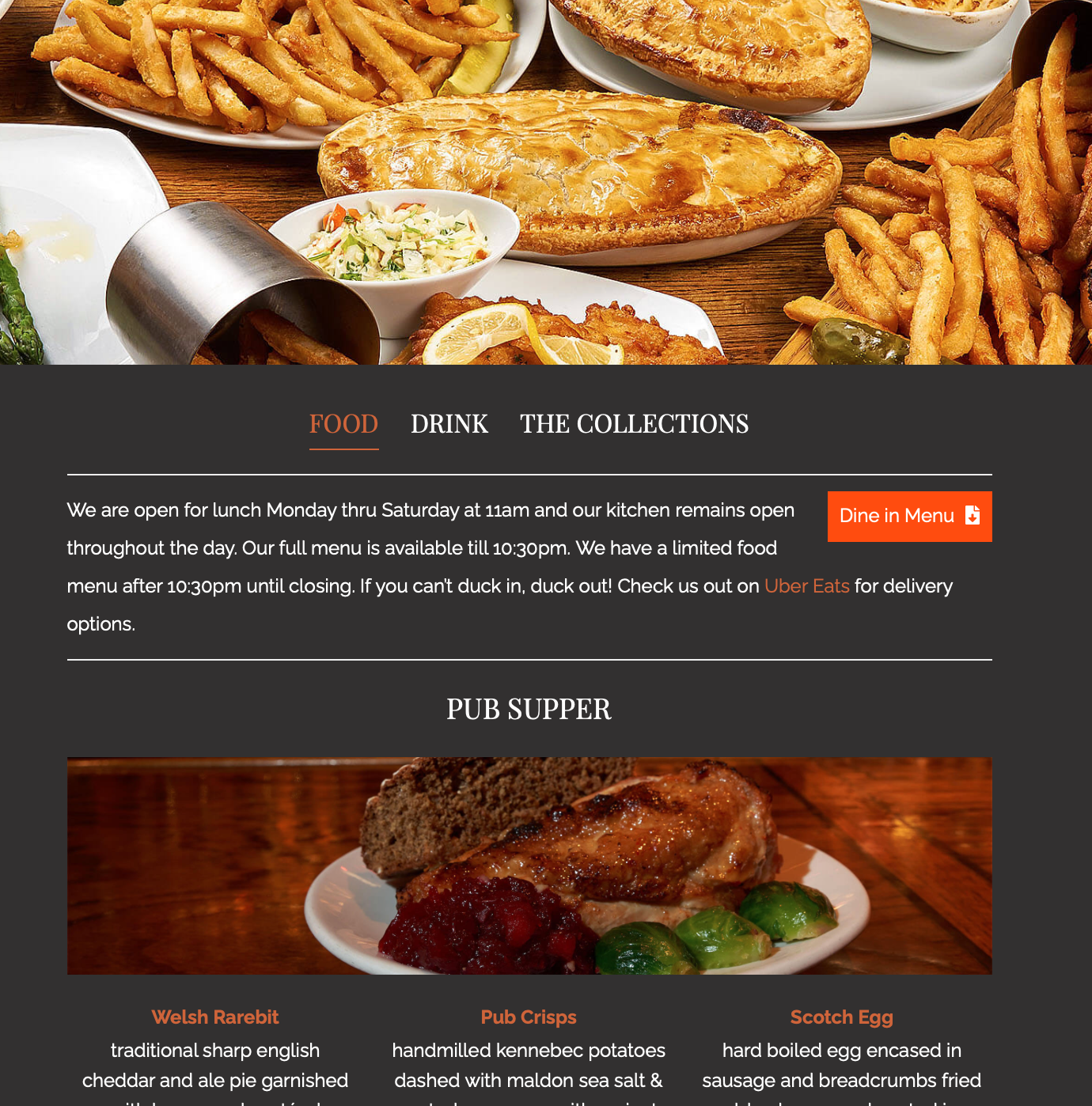
Tecture recently revamped the website and ticketing system for long-time client McGonigel’s, an Irish supper club located in Houston, Texas. As the consumer-facing online billboard for this well-known institution, the music lineup has to feel exciting, the food scrumptious, the ticket-buying experience friction-free and the overall vibe “Texas-Irish mashup”. Tecture delivered: A card-based home page that makes use of the artists’ band photos for easy scannability and to project the eclectic mix of acts • A mouth-watering menu pages that use photographs of the actual food served combine with a sophisticated menu styling • A modal shopping cart that doesn’t require the ticket-buyer to leave the band page to purchase tickets • Website design punctuated with atmospheric photos of the venue’s interiors to express its down-home vibe.
Selected FeaturesHome Page
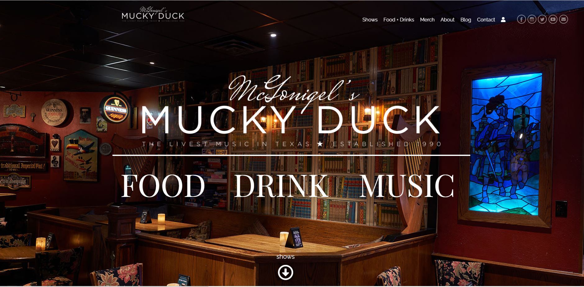
McGonigel's home page communicates the down-home Texas/Irish vibe right up front with a vivid interior hero image and illustrated show cards,
Home Page 2
The home page also features a sortable, filterable deck of show cards featuring artist photos.
Modal Shopping Cart
A modal shopping cart that doesn’t require the ticket-buyer to leave the band page to purchase tickets,
Multimedia Show Pages
Full multimedia show pages give the patron an enticing taste of the artist's vibe.
Scrumptious Menu Pages
McGonigels is known throughout the South for its delicious food. Menu pages are designed to showcase their signature dishes.

ABPM: Redesigning a Medical Board’s Public Face
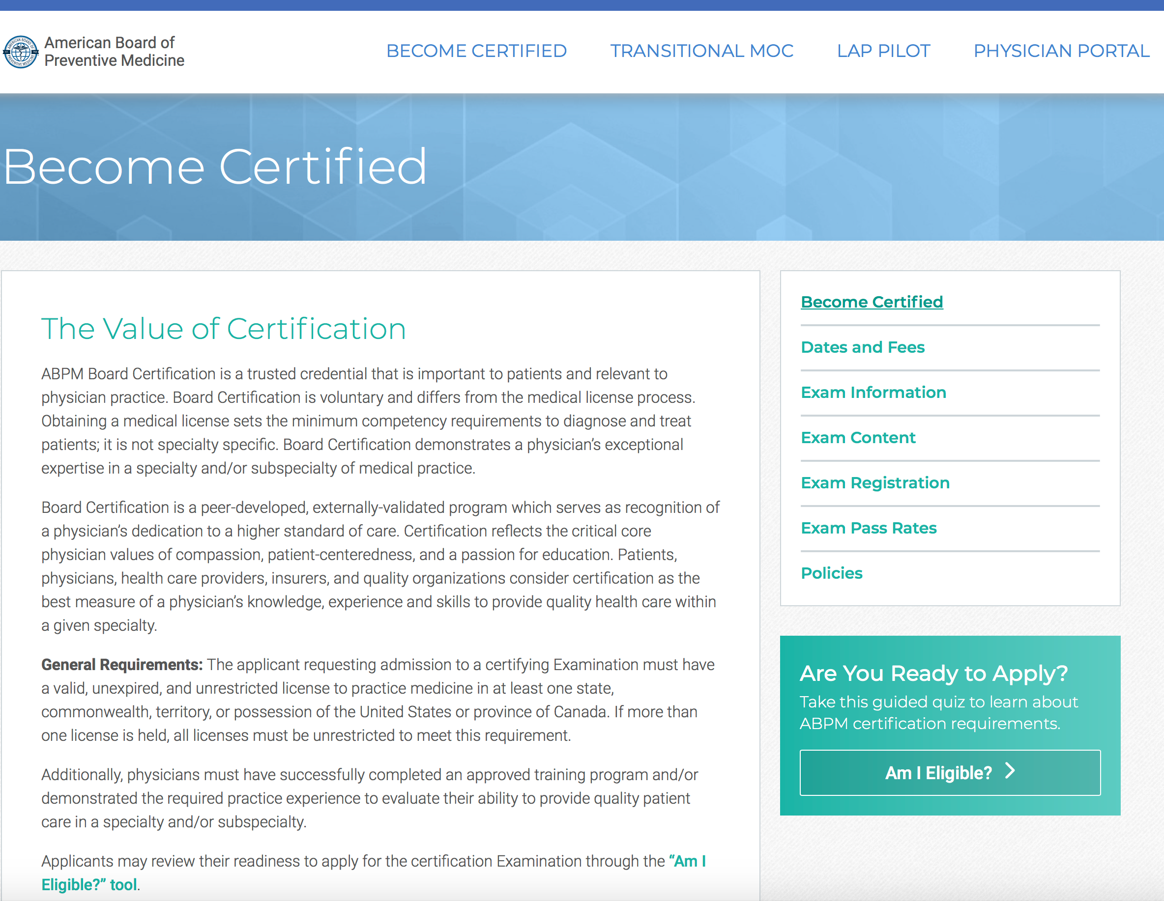
The American Board of Preventive Medicine initially engaged Tecture to bring its pen-and-paper certification applications online. In the process the Board decided to utilize our design chops to address its seriously dated public website. We proceeded to rebrand and update ABPM’s face to the world — giving it a contemporary, relevant, cutting-edge vibe, yet maintaining the gravitas and seriousness of purpose appropriate to a respected certifying medical board. Tecture implemented a cool, contemporary color palette of blues, teals and greens. We broke up the text-heavy site with plenty of white space and an open feel. We used a light-filled photographic style with a creative use of lens flare to give the home page an edgy, contemporary feel. And we redesigned the navigation to make it easy to navigate through the complex certification pathways and requirements. Finally, we designed an ‘Am i Qualified?’ quiz to assist physicians in determining if they are prepared to apply for certification.
Selected Features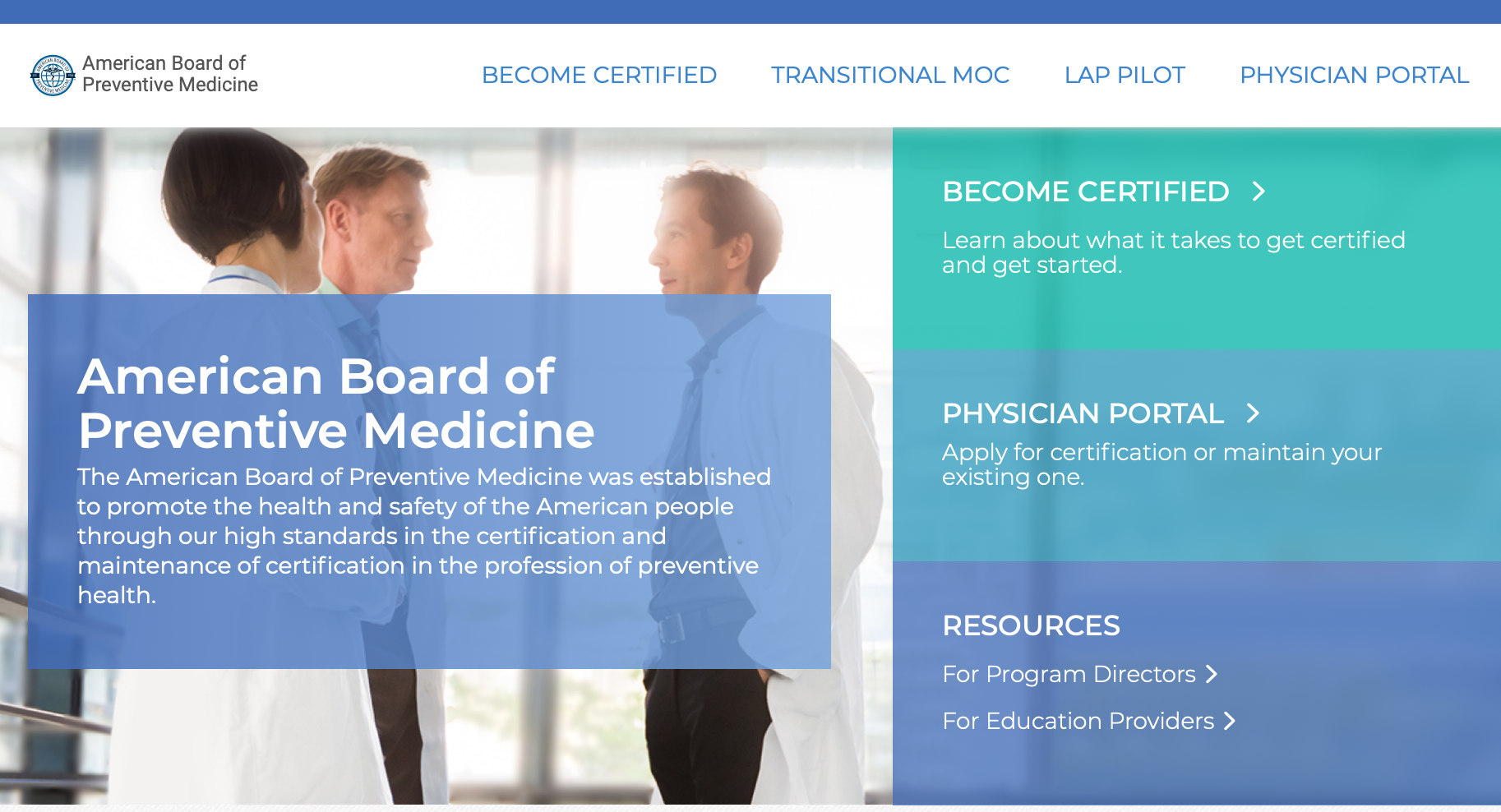
ABPM Home Page
A cool color palette and open design with plenty of white space give the site a contemporary feel.
Easy Navigation
Tecture designed easy navigation through certification pathways and requirements.
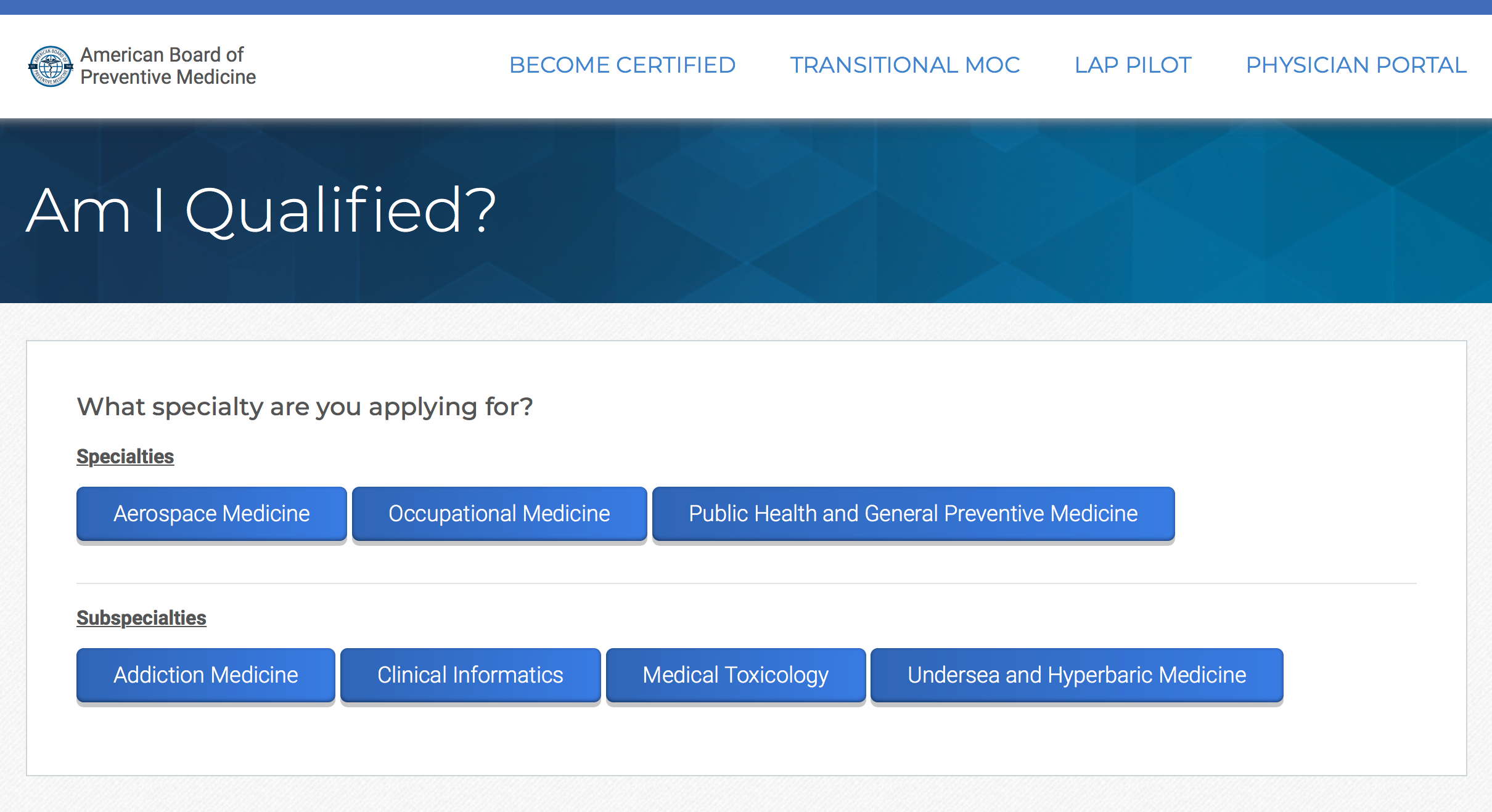
Interactive Quiz
Tecture designed an interactive quiz to help physicians know when they are ready to apply for certification.